LEARNING FROM SEOUL

Just came back from Asia! This time I stopped by Seoul - nice city! It was a short trip but I managed to ride their metro a few times and notice some interesting things about the way signage is done.

This sign gives you the distance to the nearest exit in meters:

IMG_7921.JPG

This one gives you the previous station and the next station (as opposed to the terminal station of that line):

IMG_7901.JPG

And this one is a 2D map with 3D buildings - a hybrid. I am not sure how I feel about it, but I am intrigued!

IMG_7858.JPG

W TRAIN!

The W train has been back in service since November this year and I finally found the time to update my graphics accordingly. R and W run local on the outside while N and Q run express on the inside. Check them out in our Shop page! 

Times Square N / Q / R / W lines

Times Square N / Q / R / W lines

Apply discount code BYE2016 for 15% off on all orders.

ON COLORS

I have to admit, I have been designing my prints literally with "double standards". For fonts, I stuck to Helvetica because it's the MTA standard, but for colors, I tweaked them a little to make them my own: 

Part of this comes from the graphic design class I took with professor Gavin Cooper, where he told us how primary colors tend to remind people of corporate logos - primary red and yellow will remind people of a certain fast food chain, and primary green, a coffee shop. And so I tried to push the colors a little off the original MTA pantones.

I don't think I am the only one who thinks like this. For example, I do enjoy the colors of these prints found on the design boom shop, by SuperWarmRed:

On a side note, not until I made this comparison graphic did I realized the letters N, Q and R in MTA standard are black because they are against a yellow background - a relatively light color. But I decided to keep the ones on my prints white, sacrificing a little bit of legibility for consistency's sake. 

HELVETICA

While working on my graphics for this project, I have to pick everything that goes into it- line type, line weight, paper size, paper texture, transparency etc.

The choice of font is a no-brainer, since I will just use what the subway system uses in all of their signages- HELVETICA. In fact, there is a whole documentary about this typeface:

A glimpse at the wonderful documentary (2007) by Gary Hustwit: http://www.helveticafilm.com/about.html Own the film for $10: http://itunes.apple.com/us/movie/helvetica/id284740710

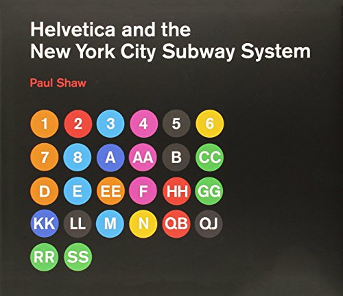
There is also a book about it:

THE PROCESS

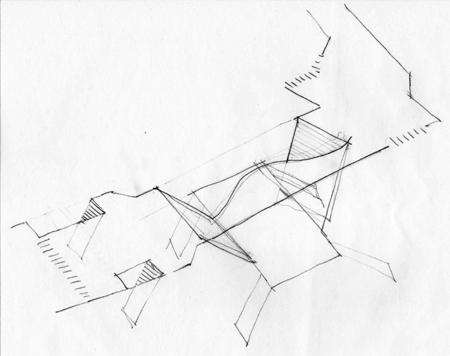
When I started this project, I naively thought I could just go walk around in the stations, take some pictures, and sketch the stations out casually like this:

But in reality, it was way harder than I thought. In order to work out where things are relative to each other, I had to developed a process to visualize the stations step by step. First, I document the entrances (from streets to turnstiles) on the neighborhood maps:

Then I make 2D drawings in the computer:

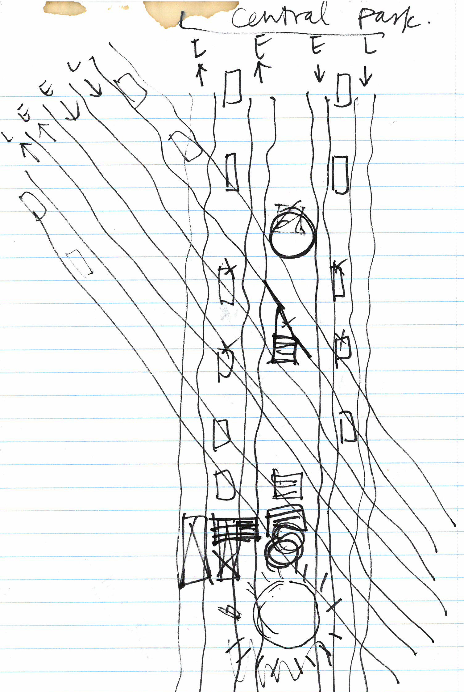
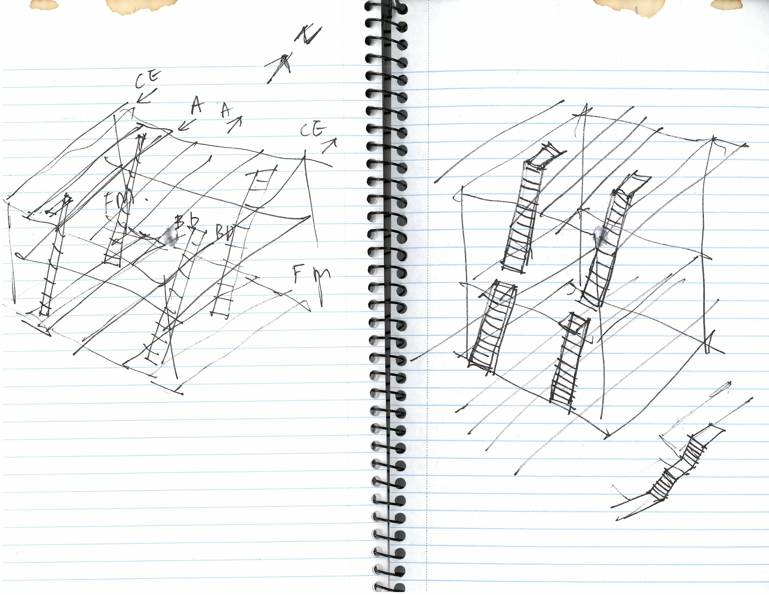
And then I go back and sketch some more, verifying my guesses and adding things I missed:

Then I model it in 3D:

And I render it:

And all of these steps kinda go back and forth and back and forth until I get the overall picture. The final graphic will be a combination of all of these. Almost there!

Pilot

It all started when my old office moved downtown to the financial district. The office is on Broadway, somewhere near the Fulton Street station. The station is HUGE -  there are so many exits that it was very confusing, and it took me and my coworkers forever to figure out how to get to the exit nearest to the office.

I am from Hong Kong, and in Hong Kong’s MTR (subway) stations, there are diagrams like these on the walls:

List of station layouts can be found here: http://www.mtr.com.hk/en/customer/services/system_map.html

List of station layouts can be found here: http://www.mtr.com.hk/en/customer/services/system_map.html

A quick search shows that Japan has similar:

And I thought to myself, why isn’t there any in NYC’s stations? Fulton Street is definitely not the only complex station, and I can't be the only person who wishes there is some form of visualization to help one find his way inside the station.

So I gave myself the challenge to make it happen, and this blog will be a record of this journey.